A mobile friendly jQuery and CSS3 menu that’s simple, image-free, and pretty.
View jQuery Mobile Menu System Demo
There are a number of great scrips and plugins out there for adding fancy mobile menus, but they normally take awhile to configure and perfect. For the do-it-yourself type, this is a light and simple jQuery mobile menu system that will get you up and running in no time and within budget.
#1 Load jQuery
If you are using WordPress, copy this into your theme’s functions.php file. If you already have the jQuery library hard coded into your theme’s header or footer, remove it and use this. WP_Enqueue_Script will make sure that jQuery is loaded (at wp_head) and that only one copy of jQuery gets loaded.
|
1 2 3 4 5 6 7 |
// Load jquery if (!is_admin()) add_action("wp_enqueue_scripts", "my_jquery_enqueue", 11); function my_jquery_enqueue() { wp_deregister_script('jquery'); wp_register_script('jquery', "http" . ($_SERVER['SERVER_PORT'] == 443 ? "s" : "") . "://ajax.googleapis.com/ajax/libs/jquery/1.7.2/jquery.min.js", false, null); wp_enqueue_script('jquery'); } |
If you want to load jQuery in the footer (wp_footer), add an extra TRUE parameter to the end of the function.
#2 Add your mobile menu HTML
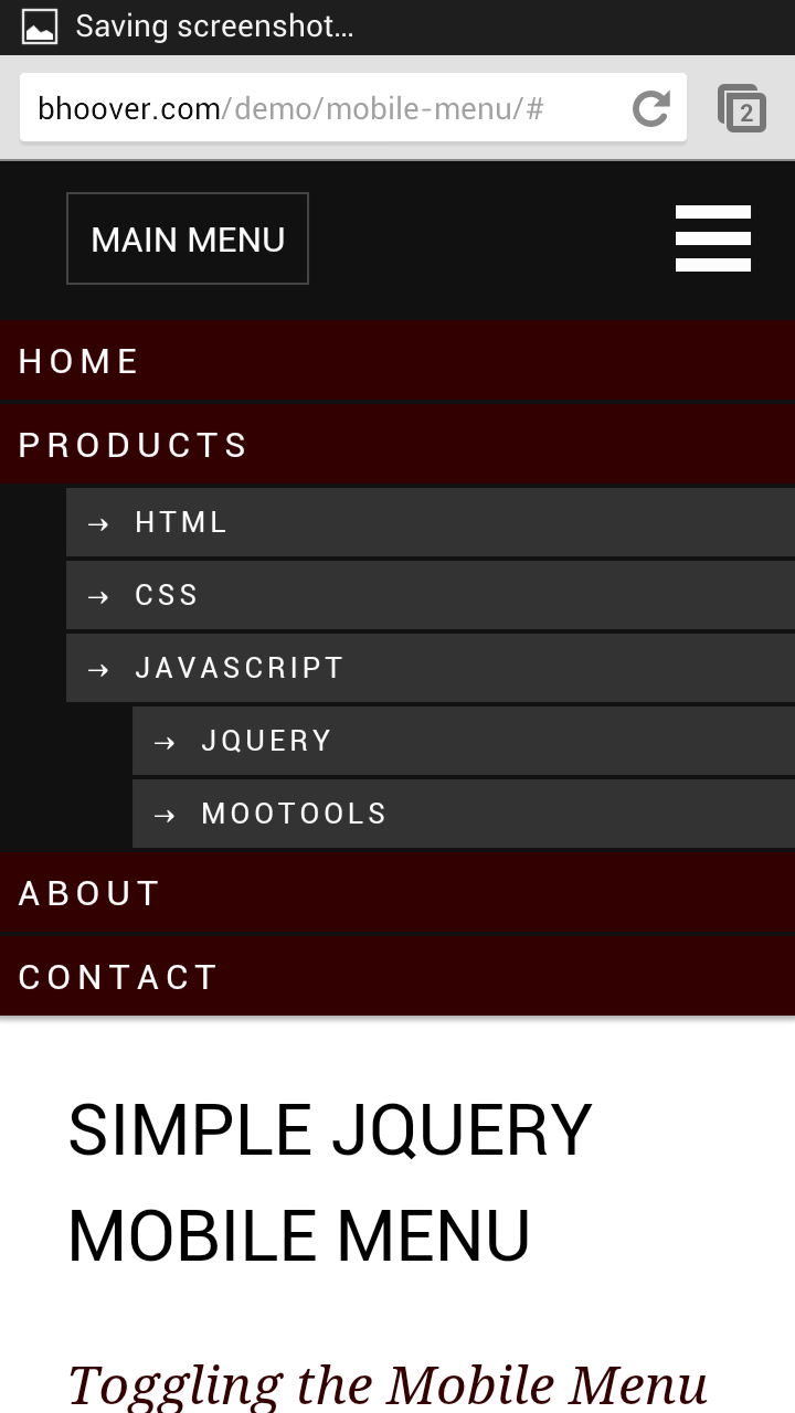
I’ve included two menu toggle (open/close) styles. The navicon (3 bar button) at the top right of the demo is becoming the mobile standard icon for menu toggling. If you are using Chrome, look to the top right of your browser and you will see it. The other menu toggle button to the left spells out what it is for. This style can be of assistance to those who are new to tablet/smartphone browsing and old people.
You could also turn the entire black bar into a menu toggle bar by adding class=”mtoggle” to the nav tag.
This jQuery mobile menu was designed to be flush with the top of the screen.
|
1 2 3 4 5 6 7 8 9 10 11 12 13 14 15 16 17 18 19 20 21 22 23 24 25 26 |
<nav id="mobile"> <div id="toggle-bar"> <strong><a class="mtoggle" href="#">MAIN MENU</a></strong> <a class="navicon mtoggle" href="#">MAIN MENU</a> </div> <ul id="mmenu"> <li><a href="#">Home</a></li> <li><a href="#">Products</a> <ul> <li><a href="#">HTML</a></li> <li><a href="#">CSS</a></li> <li><a href="#">Javascript</a> <ul> <li><a href="#">jQuery</a></li> <li><a href="#">MooTools</a></li> </ul> </li> </ul> </li> <li><a href="#">About</a></li> <li><a href="#">Contact</a></li> </ul> </nav> |
If you are using WordPress, use your WordPress theme’s menu code in place of the unordered list. Something like this:
|
1 |
<?php wp_nav_menu( array( 'theme_location' => 'primary', 'menu_class' => 'nav-menu' ) ); ?> |
#3 Add your jQuery toggle code
Make sure the jQuery library loads before this script:
|
1 2 3 4 5 6 7 8 |
<script type="text/javascript"> jQuery(document).ready(function($) { $("#mmenu").hide(); $(".mtoggle").click(function() { $("#mmenu").slideToggle(500); }); }); </script> |
#4 Add your responsive CSS:
If you add position:fixed styling rule to the nav tag css, the menu bar will stay fixed at the top of the screen as the user scroll down your page. It’s convienent having the menu bar always available, but it takes away from screen real estate. If you do make the menu bar fixed, make sure you add enough top padding to the first item in the page to be sure it doesn’t try to go behind the bar and dissapear.
You will want to hide this mobile menu on large screen devices and use your primary menu system instead. Use the reponsive CSS below to achive this. For your large screen CSS, set nav#mobile to display:none. In your mobile CSS, set nav#primary-navigation-id to display:none.
|
1 2 3 4 5 6 7 8 9 10 11 12 13 14 15 16 17 18 19 20 21 22 23 24 25 26 27 28 29 30 31 32 33 34 35 36 37 38 39 40 41 42 43 44 45 46 47 48 49 50 51 52 53 54 55 56 57 58 59 60 61 62 63 64 65 66 67 68 69 70 71 72 73 74 75 76 77 78 79 80 |
@media screen and (max-width: 960px) { #nav#full { display:none } nav#mobile { background-color:#111; box-shadow: 0 0 3px 2px rgba(0,0,0,0.3); display:block; } /* Top black bar that holds the toggle button */ nav#mobile #toggle-bar { line-height:70px; height:70px; } /* Toggle button #1 ("Menu") */ nav#mobile strong a { margin-left:30px; border:1px solid #444; padding:10px; } /* Toggle button #2 ("Navicon") */ nav#mobile .navicon { float: right; height: 6px; width: 34px; margin: 20px; border-top: 18px double #FFF; border-bottom: 6px solid #FFF; font-size:0; } /* The dropdown menu */ nav#mobile ul li { clear:both; list-style:none; } nav#mobile ul li a { display:block; background-color:#300; text-transform:uppercase; letter-spacing:.2em; margin:2px 0; padding:6px 0 6px 8px; } nav#mobile ul ul { font-size:small; } nav#mobile ul ul li { margin-left:30px; } nav#mobile ul ul a { background-color:#333; padding-left:8px; } nav#mobile ul ul a:before { content: "2192"; padding-right:8px; } } |