A mobile friendly jQuery and CSS3 menu that’s simple, image-free, and pretty.
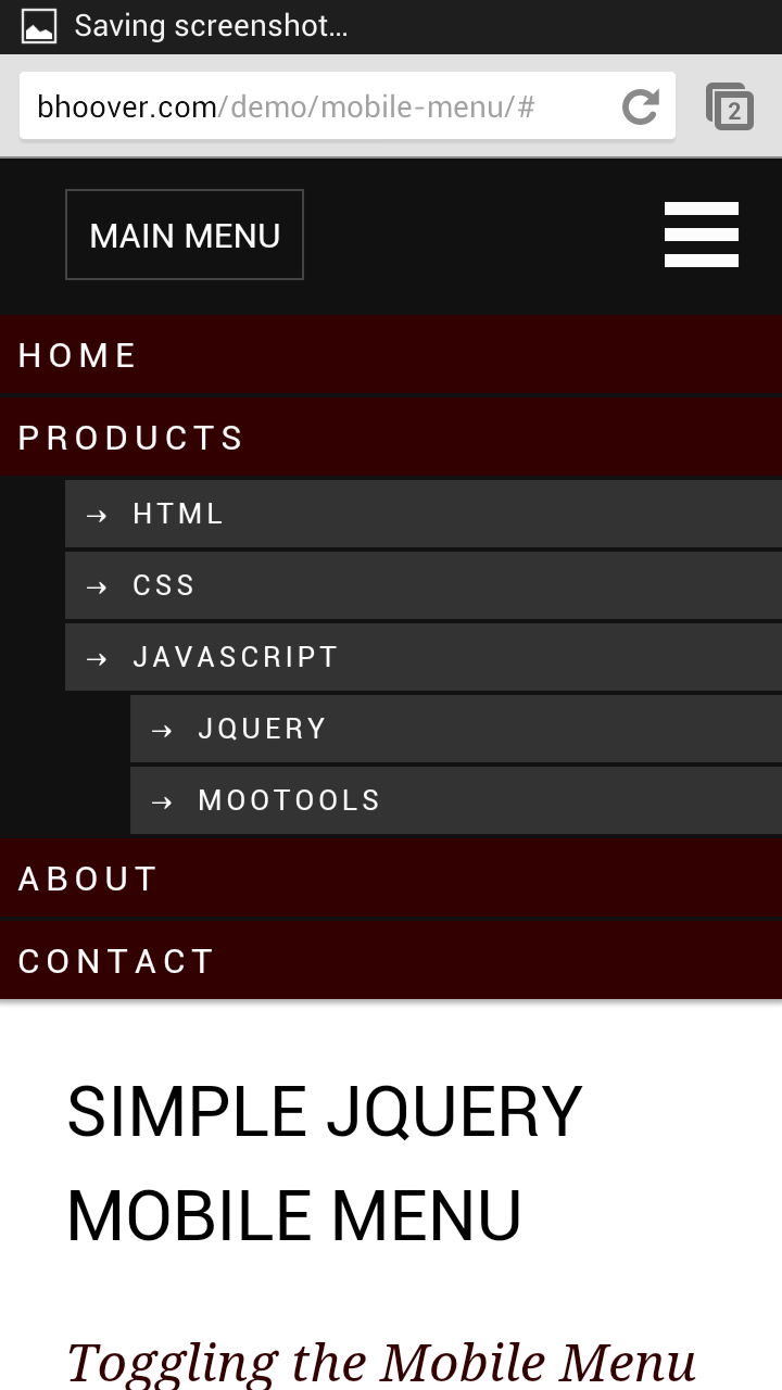
View jQuery Mobile Menu System Demo
There are a number of great scrips and plugins out there for adding fancy mobile menus, but they normally take awhile to configure and perfect. For the do-it-yourself type, this is a light and simple jQuery mobile menu system that will get you up and running in no time and within budget.
#1 Load jQuery
If you are using WordPress, copy this into your theme’s functions.php file. If you already have the jQuery library hard coded into your theme’s header or footer, remove it and use this. WP_Enqueue_Script will make sure that jQuery is loaded (at wp_head) and that only one copy of jQuery gets loaded.
|
1 2 3 4 5 6 7 |
// Load jquery if (!is_admin()) add_action("wp_enqueue_scripts", "my_jquery_enqueue", 11); function my_jquery_enqueue() { wp_deregister_script('jquery'); wp_register_script('jquery', "http" . ($_SERVER['SERVER_PORT'] == 443 ? "s" : "") . "://ajax.googleapis.com/ajax/libs/jquery/1.7.2/jquery.min.js", false, null); wp_enqueue_script('jquery'); } |
If you want to load jQuery in the footer (wp_footer), add an extra TRUE parameter to the end of the function.
#2 Add your mobile menu HTML
I’ve included two menu toggle (open/close) styles. The navicon (3 bar button) at the top right of the demo is becoming the mobile standard icon for menu toggling. If you are using Chrome, look to the top right of your browser and you will see it. The other menu toggle button to the left spells out what it is for. This style can be of assistance to those who are new to tablet/smartphone browsing and old people.
You could also turn the entire black bar into a menu toggle bar by adding class=”mtoggle” to the nav tag.
This jQuery mobile menu was designed to be flush with the top of the screen.
|
1 2 3 4 5 6 7 8 9 10 11 12 13 14 15 16 17 18 19 20 21 22 23 24 25 26 |
<nav id="mobile"> <div id="toggle-bar"> <strong><a class="mtoggle" href="#">MAIN MENU</a></strong> <a class="navicon mtoggle" href="#">MAIN MENU</a> </div> <ul id="mmenu"> <li><a href="#">Home</a></li> <li><a href="#">Products</a> <ul> <li><a href="#">HTML</a></li> <li><a href="#">CSS</a></li> <li><a href="#">Javascript</a> <ul> <li><a href="#">jQuery</a></li> <li><a href="#">MooTools</a></li> </ul> </li> </ul> </li> <li><a href="#">About</a></li> <li><a href="#">Contact</a></li> </ul> </nav> |
If you are using WordPress, use your WordPress theme’s menu code in place of the unordered list. Something like this:
|
1 |
<?php wp_nav_menu( array( 'theme_location' => 'primary', 'menu_class' => 'nav-menu' ) ); ?> |
#3 Add your jQuery toggle code
Make sure the jQuery library loads before this script:
|
1 2 3 4 5 6 7 8 |
<script type="text/javascript"> jQuery(document).ready(function($) { $("#mmenu").hide(); $(".mtoggle").click(function() { $("#mmenu").slideToggle(500); }); }); </script> |
#4 Add your responsive CSS:
If you add position:fixed styling rule to the nav tag css, the menu bar will stay fixed at the top of the screen as the user scroll down your page. It’s convienent having the menu bar always available, but it takes away from screen real estate. If you do make the menu bar fixed, make sure you add enough top padding to the first item in the page to be sure it doesn’t try to go behind the bar and dissapear.
You will want to hide this mobile menu on large screen devices and use your primary menu system instead. Use the reponsive CSS below to achive this. For your large screen CSS, set nav#mobile to display:none. In your mobile CSS, set nav#primary-navigation-id to display:none.
|
1 2 3 4 5 6 7 8 9 10 11 12 13 14 15 16 17 18 19 20 21 22 23 24 25 26 27 28 29 30 31 32 33 34 35 36 37 38 39 40 41 42 43 44 45 46 47 48 49 50 51 52 53 54 55 56 57 58 59 60 61 62 63 64 65 66 67 68 69 70 71 72 73 74 75 76 77 78 79 80 |
@media screen and (max-width: 960px) { #nav#full { display:none } nav#mobile { background-color:#111; box-shadow: 0 0 3px 2px rgba(0,0,0,0.3); display:block; } /* Top black bar that holds the toggle button */ nav#mobile #toggle-bar { line-height:70px; height:70px; } /* Toggle button #1 ("Menu") */ nav#mobile strong a { margin-left:30px; border:1px solid #444; padding:10px; } /* Toggle button #2 ("Navicon") */ nav#mobile .navicon { float: right; height: 6px; width: 34px; margin: 20px; border-top: 18px double #FFF; border-bottom: 6px solid #FFF; font-size:0; } /* The dropdown menu */ nav#mobile ul li { clear:both; list-style:none; } nav#mobile ul li a { display:block; background-color:#300; text-transform:uppercase; letter-spacing:.2em; margin:2px 0; padding:6px 0 6px 8px; } nav#mobile ul ul { font-size:small; } nav#mobile ul ul li { margin-left:30px; } nav#mobile ul ul a { background-color:#333; padding-left:8px; } nav#mobile ul ul a:before { content: "2192"; padding-right:8px; } } |
Thank you very simple and nice.
Thanks for that short tutorial
This was exactly what I was looking for!
Quick question: I’m using WordPress and set my dropdown with a fixed height/width due to needing a background image behind each menu item. Got everything to work, however, the text for the menu items is pushed to the top of the “button”. I’ve tried adjusting padding, etc. but to no avail. Any help would be appreciated.
Hi Stacy, glad you like the menu. Try setting the link line-height to the same height as your background image. That’s a great way of vertically centering text. If that doesn’t work, feel free to post a link and I will check… Feel free to post a link regardless. I wouldn’t mind seeing your modifications (assuming it’s a public site).
Thanks for the reply!! It actually ended up being an issue with padding and height. I think I looked at so much I wasn’t seeing it. Hate when it’s something simple…on the other hand that can be a good thing – even if it makes you feel like an idiot 😉
Oh well, you learn from your mistakes. Thanks again!!!
Looks good! Glad you got it working.
Thank you very simple and nice. I just tweaked to make more easier for other users. The below code will make the menu list to close once any list item is clicked (best works for one page sites):
jQuery(document).ready(function($) {
$(“#mmenu”).hide();
$(“.mtoggle”).click(function() {
$(“#mmenu”).slideToggle(500);
$(“#mmenu li”).click(function(){
$(“#mmenu”).slideUp(500);
});
});
});
What a great instruction. Thank you for your help.
I added it to wordpress. The menu scroll down but scroll up immediately, user can’t click the button. Do you know what happen?
Hi Manson – the menu toggle script is in your page twice. So the first script is opening the menu and the second one is closing it back. Remove lines 241-247 (right after the #wrapper div opening) and you will be good to go.
Interesting. However, you often state “if you are using WordPress”. I am not. i want to build a jquery mobile site from scratch. Can you provide step by step mobile menu creation/insertion instructions with that scenario? Thank you.
Hi Dennis, you can just skip over the WordPress parts. Be sure to check out the demo. That’s exactly how you would implement the menu outside of WordPress.
If I understand correctly, I need two menus, one for desktop, one for mobile, right?
That’s normally what people do. You would use CSS media queries to hide and show the correct menus.
Depending on your website design, it might be possible to get away with only using one menu. You would use CSS media queries to style it as needed for desktop/mobile. It’s a lot more work to pull that off, but you would have cleaner HTML.
Is there a way to hide a logo or push down a header image when the menu opens?
Yes, that’s how it’s setup by default. Everything below the menu gets pushed down.
However, if your logo is absolutely positioned on the page, it’s not going to get pushed down.
Another question, is there a way to open a sub menu list instead of it displaying right away?
Yes, you can use css to hide the child ul menus. Normally you would use CSS for displaying them on hover, but you are dealing with mobile devices, so you would want to use a jQuery click function to toggle the sub menus.
Ok I did, but the menus bounce up and down sometimes.
Do you have a link where I can see it?
m.cabinetconnect.net,
It seems to work on the computer, but when I test it out on some phones it does it sometimes.
Move your sub menu toggle code outside the .mtoggle click function and you should be good to go.
$(“.mtoggle”).click(function() {
$(“#mmenu, #logo, #s1”).slideToggle(500);
});
$(“.ntoggle”).click(function() {
$(“#nmenu”).slideToggle(500);
});
Thanks alot! I think that did it!
I only have one menu which is restyled depending on screen size; however, your Jquery code hides the navigation by default. How do I implement media queries with your code to open my menu on large screens and hide it on mobile size? By the way two thumbs up for the fluidity of your code. Very efficient, Bravo!
For all those who may be in need of what I was looking for, the following resolved it pain free. The purpose of this script is to keep a responsive menu closed at a maximum pixel size of 600 (only opens with a trigger button) while allowing it to be opened and active without the use of the trigger button above that size.
jQuery(document).ready(function ($) {
var smallWindow = false;
$(window).on(‘resize’, function () {
var windowsize = $(window).width();
if (windowsize 600 && smallWindow) {
smallWindow = false;
}
}).trigger(‘resize’);
});
This script is credited to: http://stackoverflow.com/questions/15229628/jquery-unable-to-trigger-function-under-two-conditions
I apologize for the abbreviated script. This is the full script as intended:
jQuery(document).ready(function ($) {
var smallWindow = false;
$(window).on(‘resize’, function () {
var windowsize = $(window).width();
if (windowsize 600 && !smallWindow) {
$(“#main-menu”).show();
}
}).trigger(‘resize’);
});
Thank you so much for this short and straightforward tutorial.
Great tutorial, but how is the mobile menu icon displayed? (I.e. the three lines.)
It’s the “nav#mobile .navicon” css that create the navicon.
Exactly what I was looking for 🙂 Simple effective and beautifully styled. I am trying to get the menu to close on click but am a jquery appi. Could you please assist?
With thanks 🙂
Used Sunil’s code. Working with many thanks to you and the community!
Many, many thanks for sharing this simple menu option. I almost spent a day looking for a simple responsive menu. Finally, it solved all my problems…Thanks again…
hey,
please help me.. how do I set the width of the menu that opens?!
thx
It should already be 100% width. If not, try adding #mmenu {width: 100%} to your css. Leave a link if you still have trouble.
This is working great! Thanks so much for the solution, am loving it. However, having two small problems – I tried doing the submenu click-function you mentioned in the comments – however, it isn’t working (it just goes to the link instead of opening the child links). Is this possible with WordPress? (I’m thinking that’s probably the issue somehow).
Second, the menu shows a strange “2192” number before every link. Has anyone else encountered this, and how does it get removed?
Thanks!
Try adding “event.preventDefault();” line inside your submenu’s click function. That will prevent the parent page from loading and allow your function to continue with expanding the menu.
http://api.jquery.com/event.preventdefault/
$(“.open-sub-menu”).click(function() {
event.preventDefault();
$(“.sub-menu”).slideToggle(500);
});
Nevermind on the 2192, found it! 🙂
Can be set, to close the menu, when you click on a link from the menu, or by pressing the ESC button to close the menu, or click on the video to close that menu?
Sunil Kumar has the “close menu on item click” function in the comments above.
To close the menu when clicking outside, something like this would work: http://stackoverflow.com/questions/2868582/click-outside-menu-to-close-in-jquery
For escape key to close, use a keydown function like this: http://stackoverflow.com/questions/9333531/hiding-a-div-with-esc-key-and-off-click-in-jquery | https://api.jquery.com/keydown/
thanks, but how do I implement this script .. can you help me?
Do you have a link so you can show me what you have tried to far?
Your tutorial is nice, simple and highly recomendable. 2 minor suggestions: 1. Leave a downloadble copy at your homepage and 2. Maybe you should point out that you have to narrow to a screenwith lower that 980 pixels to make it work. That could save sleepy monday morning programmers like me for a little time. But again: Your tutorial is really excellent. Thank you!
Thanks for the feedback! I’ll try to update the tutorial as soon as I can.
Hi, I love this menu, and I’m trying to implement it on my site. But I’m having trouble as the menu appears behind the elements below it. Have you seen that before? Is it possible it’s because the elements below are elements created using hype?
Try adding a high z-index value to nav#mobile so it stacks in front. Something like this:
nav#mobile {

    /* Your other css rules... */

    z-index:9999;

}
I actually realized I put the menu within another div, so there was nothing below it to push. Thanks!
Very Nice and Simple to use! Thanks for your time!
Hello,
Very nice and simple to use.
Is there a way to make the navigation slide from the left instead of below, pushing the main content area to the side?
e.g. hertsshow.com (mobile view)
Thanks
Thank you. Found this via Google search. I used this technique upto yesterday where I suddenly had to add jquery 1.10.2 in stead of 1.7.1 that I used before. I also had to add 1.10.2 twice, one in body too, to get a keyboard menu working. Gonna test the extra code at the bottom. – Thank you for providing.
I have a question. I’m using your Jquery fixed nav and it works great. I have a minor problem with it though (a preference). I would rather have the content of the navigation overlap the page instead of pushing the page down along with it (when the menu button is pushed).
I read your documentation and it tells me to use position:absolute if I want it to overlay the page instead of pushing it down. However, you did not specify which class to add position absolute to.
I tried it on the mmenu class and also the toggle, but it messes up with the navigation. It doesnt overlay it it still brings me to the top of the page when I scroll down and click the menu button.
Any help?
You will need to add it to the navigation ul (#mmenu). You might need to do some extra styling once you make it absolute:
#mmenu {
position: absolute;
width: 100%;
z-index: 9999;
background-color: #000000;
}
Having some troubles making this work. The toggle icon is shown on my page, but nothing happens when clicking on it. I have jquery loaded in header of the page.
This is the menu:
{snip}
This is the Javascript, placed within body:
/* mobile menu */
jQuery(document).ready(function($) {
$(“#mmenu”).hide();
$(“#mobile-toggle”).click(function() {
$(“#mmenu”).slideToggle(500);
});
});
Any idea what could be wrong?
Could you post a link to it? Or copy your code into a JS fiddle link?
Thanks for your post, Brandon. Yes, I see, my code code changed in my post. Here is the page I am working on: http://tinyurl.com/qf33veq
regards
Thom
Your mobile menu html is using #mmobile instead of #mmenu. Swap out #mmenu with #mmobile in your javascript so it matches up.
How dumb of me. Thank you. Seems I switched things around so often until I did not see the forrest anymore within all those trees.
Now its opening, but its not switching back. I suppose using two times the same id=”mobile-toggle” does not work as I intended.
Thanks again
Thom
Yes, delete the second #mobile-toggle and add “z-index: 9999” to your #mobile-toggle css to keep it visible.
You are great! Thanks. Now it works. I would have gone a much more complicated way to solve that. Greetings, Thom
Hello. This worked great for me and was exactly what I was looking for. Having one issue though.
I was wondering how you could close the menu after clicking on one of the list items.
Right now I click on a list item and it takes me to the section but the menu stays open. When I click my toggle menu icon to close the menu it takes me back to the top of my site.
Let me know! Thanks!
If you are not loading a new page when a menu item is clicked, you could add some extra jquery to make the menu toggle closed whenever a link is clicked. Something like this: $(“#mmenu a”).click(function() { $(“#mmenu”).slideToggle(500); });
To stop a page from jumping to top when a link is clicked, use “event.preventDefault()” in the click function.
Hi,
I love the code you provided. With a few tweaks in styling, the menu looks superb on my site. Nice and simple and fast to load.
But I’m having one strange problem.
During page load, the menu seems to default to “open.” Then, as the page load, the menu “closes.” The result is that when you browse from page to page, the menu seems to “jump around” – at the beginning of page load it appears open but as the page continues loading, the menu snaps closed again. Makes for a rather jarring effect.
Any thoughts to what that might be?
hey thanks for that nice menu.
You need to update the style in yout tutorial to your actual style:
view-source:http://bhoover.com/demo/mobile-menu/style.css